Ink Review - Califolio Ohlanga

I am very picky when it comes to teal/turquoise inks.  Often I find that they are too dark, or lean to far in the blue or green direction and don't strike a harmonious balance.  The one that I have liked the most so far is Iroshizuku Ku-Jaku, but even that one would not get enough use to justify the purchase of a full bottle.  This particular sample was part of an order from Vanness Pens a while ago that I have recently gotten around to trying out.

This ink was fine in the performance department, behaving pretty well on the wide range of paper types I encountered while grading.  The color is okay, but I prefer the more saturated version that I got on cheaper paper versus the somewhat pale appearance on Tomoe River (what you see above).  I would ask for more shading and water resistance, but that's a personal preference.

Overall, this ink is nice but not great.  The one thing that I will give it is that the lack of extreme shading means that you could probably get away with it in an office environment but the color was different enough from the royal blue that most pens use to also allow me to use it for grading.  I also am not sure that it's sold anywhere other than Vanness Pens, so if you want it you are at the mercy of whether they can stock it.  My recommendation is to go with Ku-Jaku because it's so much more widely available and I think it's a superior teal.

Ink Review - Iroshizuku Yama-Budo

I have been excited to try this ink for quite a while.  Depending on the batch you get, Noodler's Black Swan in Australian Roses can be a near twin for Yama-Budo.  And, since my bottle of BSiAR did not manage to make the trip with us to Virginia, this sample (courtesy of my friend Paul, thank you sir) is the only immediate access I have to such a lovely color.

I have mostly been using Yama-Budo for grading over the past week, which means lots of writing on cheap copy paper and in various grades of composition books.  Overall, it's very well behaved and only shows a bit of line fuzziness on the worst of papers.  I actually might like it a bit better on cheaper stock, as more ink gets soaked into the page and results in a more saturated color that leans towards purple.  It's hard to see in the scan above (which was done on Tomoe River), but the ink seemed a bit dull once it dried.

Overall, I have a hard time saying anything bad about Yama-Budo.  At the same time, I won't be purchasing a full bottle any time soon.  Yes, I like the color, but obviously I did not like it enough to bring my bottle of BSiAR with me because I just don't reach for it that much.  It's not very professional, but I do think it can find a happy place on an ink shelf if you are looking for a fun ink to use for correspondence or you want an ink to grade in that isn't red.

Ink Review - Chesterfield Fire Opal

How is it November already!?!  This is how I know that I'm starting to get old, when months seem to just fly by.  But, it's not so bad since November is going to be devoted entirely to inks here, with a focus on oranges and browns to celebrate Thanksgiving coming up.  The first is this ink, which is part of the Chesterfield line sold through xFountainPens.  The Chesterfield inks are rebranded Diamine inks (FPN thread here), so I will do my best to figure out which of those inks they match up with.  There is a spreadsheet that was made by a member on FPN, so I will go off of that and if things don't seem to match, I'll hunt around until I find what does.

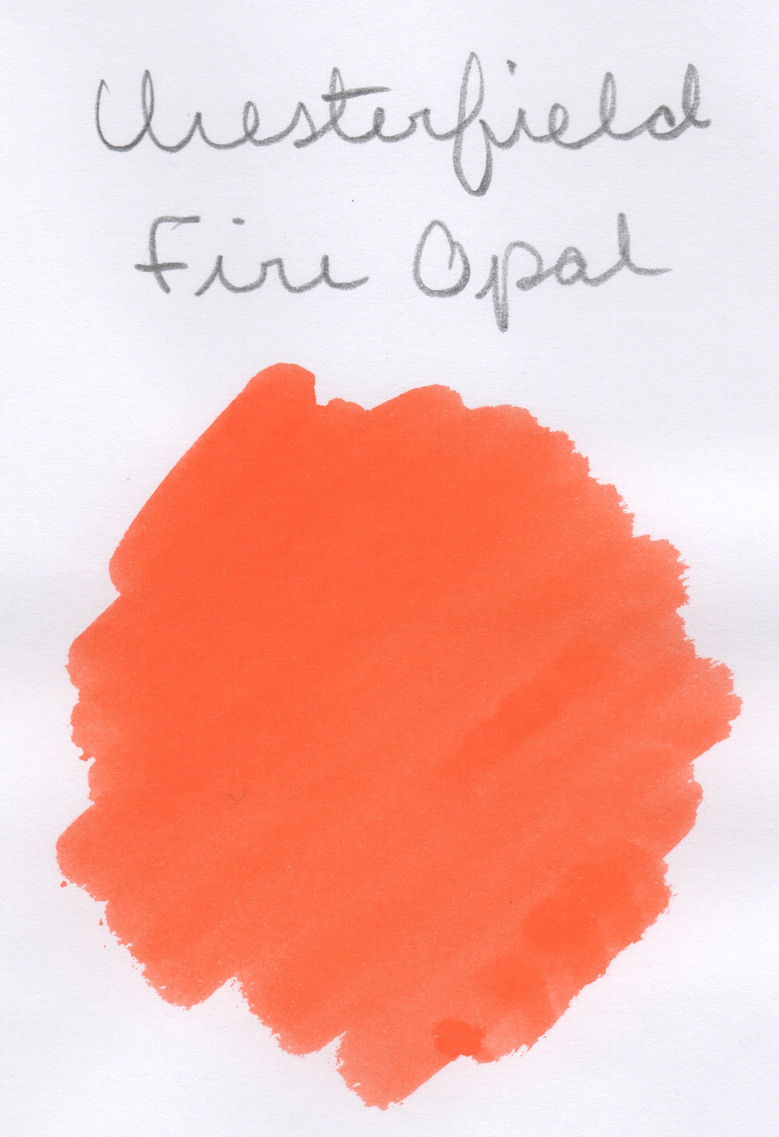
I've spoken before regarding my feelings towards the color orange.  This one falls into the side of the orange spectrum that really irritates me, so I will be glad to get it out of my pen soon.  On the other hand, it is a super bright, well saturated orange, which could have a place if you are grading or editing.

The intense saturation means that shading is not pronounced, at least not in a finer nib.  The ink was pleasant to write with, with no hard starts or feathering or bleeding.  There was some nib creep and my understanding/observation is that this is not uncommon with orange inks and not something to worry about.  As you can see above, it has no water resistance, but it fared well with both liquid and dry highlighters (though I cannot understand why you would want to highlight such a retina-searing color, but hey, you do you).

Fire Opal was also well behaved in a Pitch Black Field Notes, so this could be an ink you could use in your daily carry.

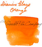
Now, the spreadsheet I linked above matches this ink with Diamine Orange.  I grabbed that and a few other oranges from the Goulet Pens Swab Shop tool, so let's see if that is indeed the case!

I would definitely agree with that match.  There is a bit of difference in terms of color correction in the scans, but I think the telling sign is the underlying red hue present in both the Chesterfield Fire Opal and the Diamine Orange.

Like I said, this ink gets on my nerves hardcore.  But, it was otherwise a nicely behaved ink and I can't complain about it except for the my bias against the color.  You also get a pretty nice discount buying the Chesterfield vs Diamine, at $10/100 mL for Chesterfield and $15/80 mL for Diamine.  Of course, neither of those prices is outrageous, but why not save a few dollars if you can?  The biggest difference is that the Chesterfield comes in a plastic bottle rather than glass, and my experience with those bottles is that the neck is quite narrow.  Thus, it might be best if you have another container to decant into, or you are planning to syringe fill.

This ink sample was given to me as a gift and I am not being compensated for this review in any way.  All opinions expressed above are my own, and you are free to disagree if you like.

PS - I've decided to start taking my quotes that I put in reviews from my current favorite songs, so that you can all see what horrible taste in music I have.  Anyway, I'll try and remember to put a link to the song referenced at the bottom here, in case you want to take a listen.  They won't necessarily relate to the ink being reviewed, so sorry for any confusion there.


Ink Review: Noodler's V-Mail North African Violet

I don't know why, but when I first inked up this pen, I didn't really like this ink.  I honestly could not tell you why, because now that I've used a fair amount of it I really like it!  Strange how those things work, huh?

This ink comes from a line of Noodler's inks called the V-Mail line.  If you want to know more about them and the inspiration behind them, you can find that here, as well as reviews of all the inks in the series.  I'm not certain that I'll be covering the others in the immediate future, but they are in the Swab Repository and feel free to let me know if you want to see them sooner rather than later (feel free to do that with any of the inks in the Repository, to make it easier for me to pick my next ink!).

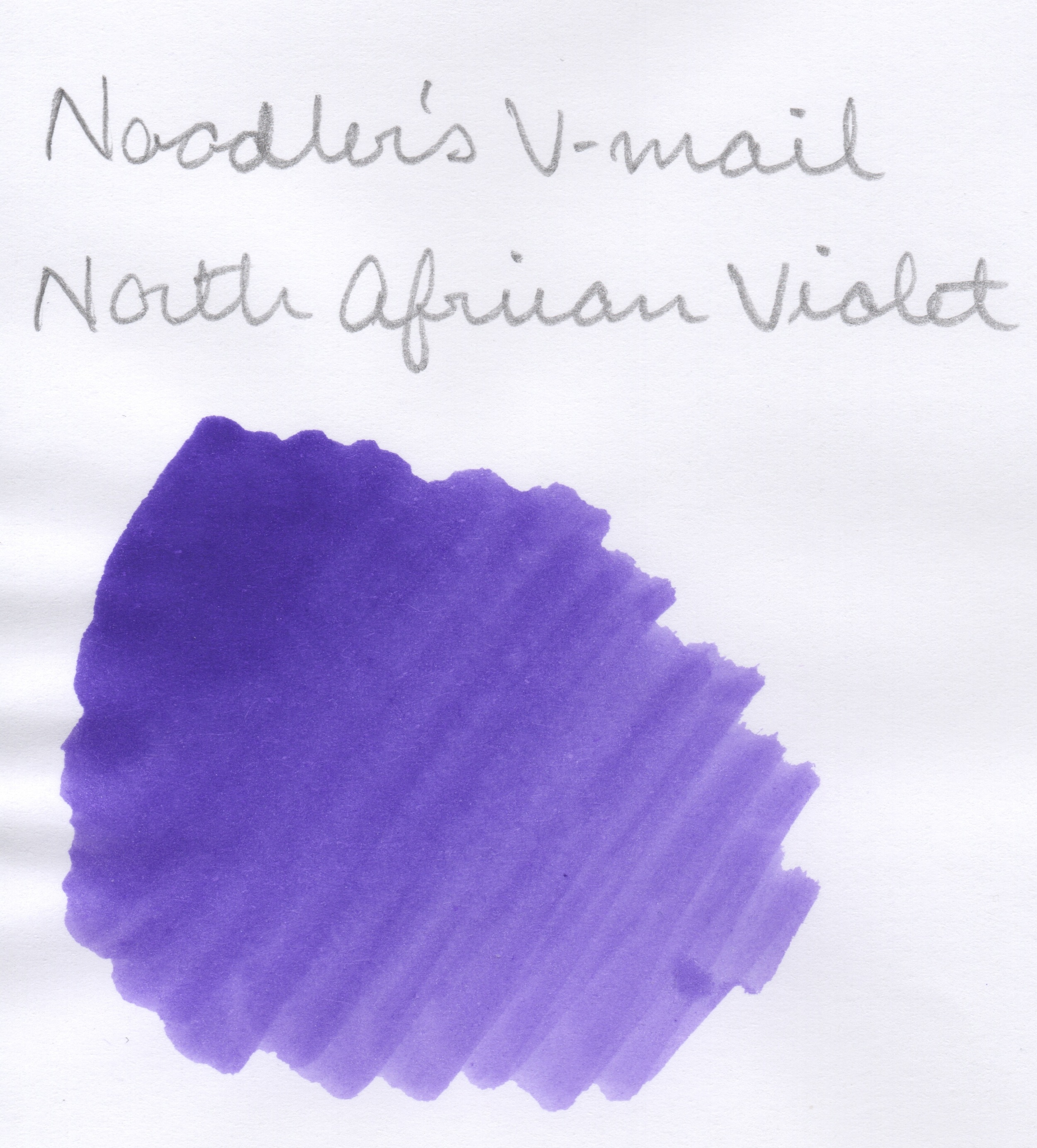
*Note - I don't know why all of my scans for this review seem a bit fuzzy.  But it's not your eyes, it's me.  I'll clean off my scanner and hopefully that will resolved the problem for next time.*

Overall, this ink has been very well behaved and a pleasure to write with.  The color is an indigo violet, which I prefer as opposed to the purples that lean more to the red side.  On good paper I had no problems with any bleeding or feathering and did not notice excessive dry times.  While not a huge shading ink, there is some to be had and the ink is definitely light enough to make it noticeable.

It also held up well to both liquid and pencil highlighters (I have found that some pens will smear with the "dry" highlighter pencils, which is why I have started testing them).  I was also pleased to see that this ink scoffed at water drops and in the image above it's hard to tell that I even did the water test at all.  

I also thought it might be worthwhile to test the ink in the same Field Notes Pitch Black that I was using during Pencil Month, and it was surprisingly well behaved there.  The line does seem a bit fatter, but it did not feather or bleed.  There is some show-through on the back side but it is still usable.

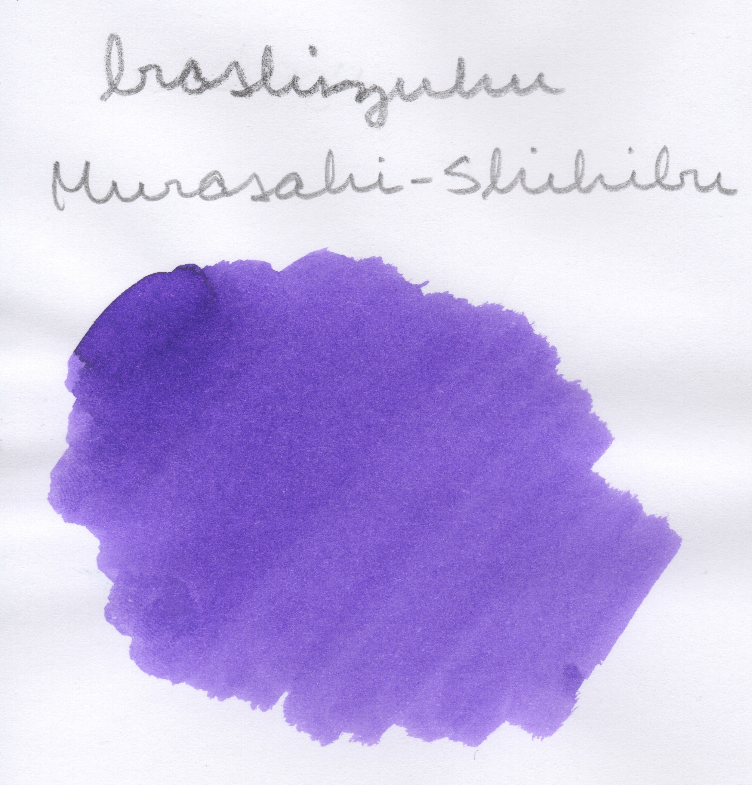
Overall, I think this is a nice ink that is worth a try.  It's nothing mind blowing, but sometimes you just need something basic that works.  Especially because the color is more on the blue end of the spectrum, I could see this being an ink that could be used in a workplace where blue pens are allowed, and the waterproofiness means that it would probably be okay for signing official documents, as well.  Also, if you like Iroshizuku Murasaki-Shikibu but you don't like the price, this ink is a dead match as far as I can tell.

This ink was provided to me for use and review and I am not being compensated for this review in any way.  All opinions above are my own and you are free to disagree with them if you like.

Ink Review - J. Herbin "Emerald of Chivor"

Uffda, it feels like I've been working on this post forever!  Of course, that's not entirely true, but with how far it got pushed back due to my illness last week, it has been on my mind longer than most.  So let's get to it, shall we?

Emerald of Chivor, henceforth referred to as EoC, is the latest in the 1670 line of inks from J. Herbin.  The really special things about these inks are that 1) they all contain shimmery particulate, and 2) they have bottles that are quite pretty to look at but impossible to fill a pen from.

I'm quite sure that this is because I am becoming curmudgeonly in my old age (I turn 26 this week, so it's a downhill slide from there), but I am so over the shimmery ink trend.  Everyone loses their bananas when a new 1670 ink comes out, and with the new Diamine Shimmertastic inks it feels like I'm back in middle school and everyone has those awful glittery gel pens.  I get that these inks are pushing boundaries and can produce some really cool effects when used artistically, but my experience has been that shimmery inks are pretty underwhelming when used like normal ink with a nib on the finer end of things.  If you want to read my reviews of other 1670 inks, you can find Rouge Hematite here and Stormy Grey here

I'll stop ranting now and talk about the ink itself a bit.  For EoC I did not test highlighting, since I figured that very few people would be highlighting an ink like this.

Shimmery-ness notwithstanding, this is a very pretty ink.  The base is a pleasant, dark teal that exhibits a decent amount of shading and would be appropriate even in a professional setting, as it is fairly inoffensive.  As you can see in the image above, there is no gold sheen visible in my normal writing, and the full effect for the swab is only achieved under direct sunlight at certain oblique angles.

I found the dry time to be very fast, but of course that will vary with nib size and wetness of a given pen.  I also didn't notice any bleeding or feathering with this ink, but I primarily used it on premium papers like Clairefontaine Triomphe and Tomoe River, with a small amount of writing in a Field Notes Workshop Companion notebook.

In terms of water resistance for EoC, there is none.  I'm not too surprised by this because my experience is that the other 1670 inks are not terribly water resistant, and this ink is also not exactly marketed to the crowd that is using their pens to label important documents for archiving.


Based on my rant at the beginning of this post, you will probably not be surprised to hear that I am not telling you to go buy this ink immediately.  If you really want to try it, I definitely suggest picking up a sample or even going half-sies on a bottle with a buddy.  But, unless you are an artist or you plan to use this ink to write out holiday cards (hey, there's an idea...), I doubt that this will be an ink that will be consumed by anyone at an appreciable rate.  If you enjoy the base color but don't really care much about the sparkles, you can check out similar inks here and see if one tickles your fancy for probably a decent amount less cash.

This ink was provided to me for the purpose of use and review and I am not being compensated for this review in any way.  All opinions above are my own and you are free to disagree with them if you like (especially this time, since I know I'm in the minority on shimmery inks).