Paper Review - Clairefontaine Triomphe Tablet

I know, I know - my paper reviews are pretty few and far between.  Especially with papers like this, that are made specifically to be fountain pen friendly, I'm not sure exactly what there is to say, but we will give it a shot...

The Triomphe tablet comes in both A4 and A5 sizes (that's roughly letter and half-letter size, if you aren't familiar with the paper sizing the rest of the world uses) with blank or lined pages.  Each pad contains 50 sheets of super silky, bright white paper.

The version that I have is the A4 blank and I have used 17 pages out of it so far.  I have been using it for ink reviews, a few pencil reviews, and writing letters.  While my writing is fairly straight on its own, luckily the blank tablets come with a ruled guide sheet so that I don't have to trust my hand being steady.  The pages are semi-opaque, striking that delicate balance between allowing you to use the guide sheet and not having the show through concerns of Tomoe River.  In the photo below, you can just barely see the guide lines if you hold your screen close enough to your face.

Like I said, I have used this paper with a wide variety of instruments and I feel like I have figured out where it excels and where it is a bit lacking.

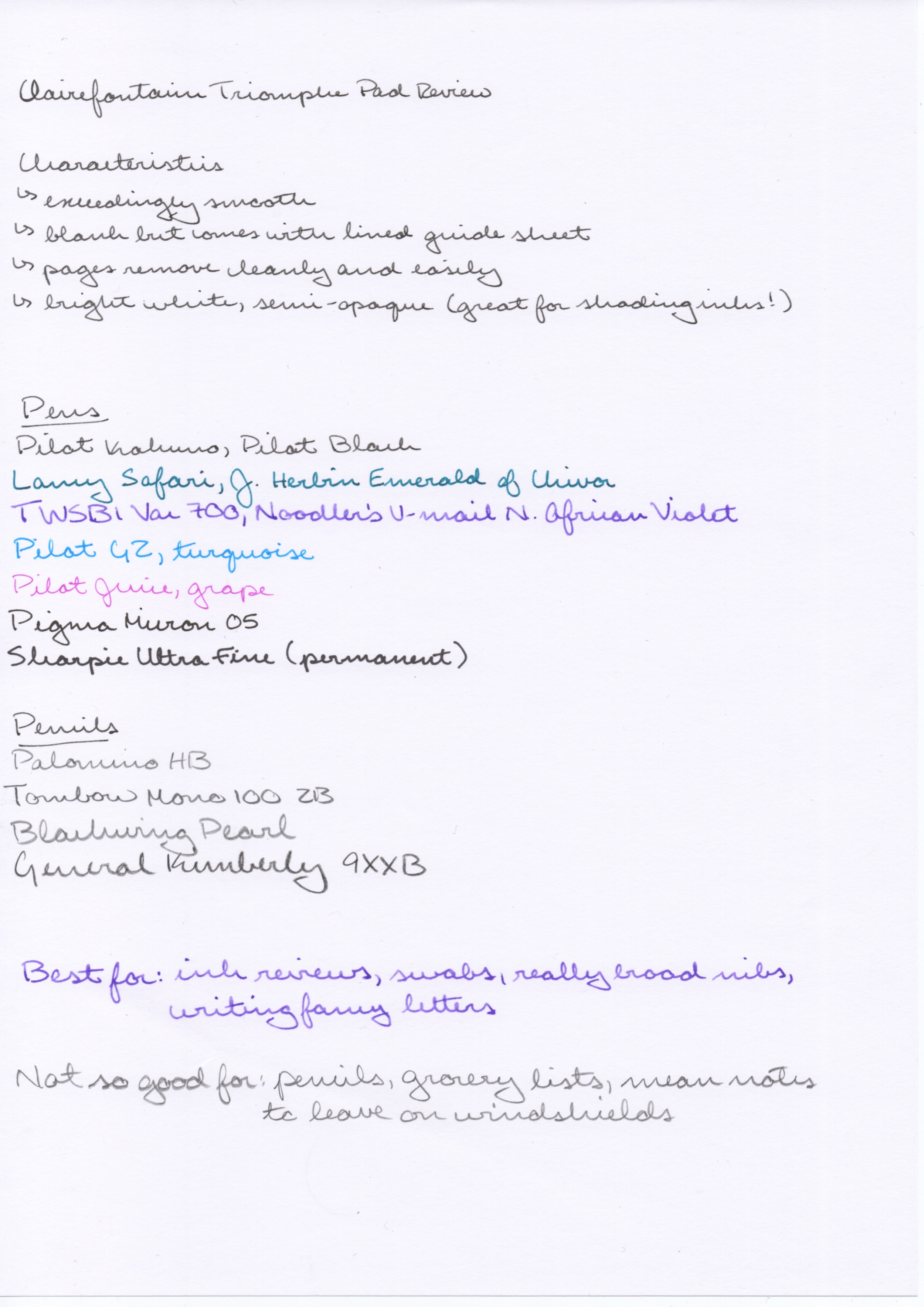
With fountain pens, this paper is a dream come true.  It can handle very wet nibs, swabs, water tests - pretty much anything you can throw at it.  The fact that the paper is white and not cream also makes inks pop and shows off shading beautifully.  Gel pens, like the G2 and Juice, were not quite as nice, as the fine points combined with the slick ink combined with the smooth surface made me feel a bit out of control while writing.  Felt tipped pens like the Micron were pleasant, and even the Sharpie was a nice writer but it was also the only one to bleed through.  This would imply to me that other alcohol based pens (like Copics) would also bleed.

Similar to the problems with gel pens, pencils on this paper rub my nerves raw.  With a pencil I expect to feel a certain amount of toothiness and that is absent on this paper, making me feel like I'm unicycling drunk (okay, I don't know how that feels, but I am assuming it would feel very out of control).

Overall, I would recommend this paper if you have a good reason to use it.  It's certainly not super expensive, at $0.18/page, but it's also not paper that you would want to chew through like crazy.  Even if I only used it for ink reviews, I could justify having a pad of this around all the time.  Add to that letter writing and I will certainly get full use of this tablet.  (I also printed a copy of my resume on a sheet and stuck it in my bag, just in case.)  Thus, I recommend this paper most for people who like to use fountain pens and either write ink reviews or letters to friends who deserve nice paper.

This paper was given to me as a gift and I am not being compensated for this review in any way.  All opinions above are my own and you are free to disagree with them if you like.

Paper review - Field Notes Cherry Graph

Follow the spring 2014 Shelterwood limited edition, the Cherry Wood Field Notes brings woodgrain back into regular rotation.  For now it is a regular edition, but non-kraft regular editions have been known to disappear in the past so I will definitely be keeping an eye out for any announcements of this edition being discontinued so that I can stock up.

Field Notes Cherry Graph with a brown Pilot Juice

Size
This notebook is the standard “pocket size,” aka 3.5” by 5.5”, which happens to be my preferred size for a pocket notebook versus a passport size (which is just as wide but slightly shorter) or an A6 (which is slightly larger is both directions).  Still small enough to fit even in the tiny pockets on women's jeans while maximizing writing space within that constraint.  That said, these would not be my favorite notebooks to draft a novel in, but for carry-around-beat-em-up books they are ideal.

Binding
Field Notes uses a three staple saddle-stitch method to bind their books and this one is no exception.  It’s certainly not the most robust method ever, but it works.  If you are carrying these notebooks naked in your pocket for any extended length of time, it’s quite likely that at least one of the staples will lose its hold on the cover before you run out of blank pages, but my notebooks tend to be chauffeured around in a case of some sort and they have all survived just fine.  

Something extra special about the staples in this edition is that they are gold colored instead of the standard silver, and with the woodgrain cover they really make this feel like a luxury item rather than a stock edition.

Paper
One thing I really like about most Field Notes books is that they use bright white paper.  Sure, cream and soft white paper have their place, but I don’t like having the color of my writing muddled by the color of the paper and I have rejected many notebooks in the past for not having the right color of paper (Rhodia Webbie, I’m looking at you).

The grid in these notebooks is printed in a light brown, which they identify as “Double Knee Duck Canvas” in color.  I don’t know what that means, but it ties together well with the overall color scheme and walks the fine line between being dark enough to be useful while not being so dark as to be obtrusive.  Also, the 3/16” spacing works perfectly for my handwriting, especially in a pocket notebook where I’m not using fountain pens primarily.

The reason that I don’t use fountain pens much in this (and most Field Notes editions) is because the paper is not the most friendly to liquid inks.  Pens don’t feather much but they do bleed, even finer nibs, and I am too much of a tree-hugger to only use one side of each sheet.  I don’t mind that I am “forced” to use other quality pens like the Pilot Juice in here because then I don’t have to worry about dry times or waterproof-y-ness either.

Cover
Let’s be honest, the cover is really what makes this a special notebook.  And the cover is definitely something really special.  As far as I understand, it is made using the same process as the Shelterwood, where a super thin layer of real wood is glued to kraft paper and then viola, you have a wood grain cover!  Because of the natural origin of the wood veneer, no two covers will be identical and I really enjoy that aspect.  There is also a slight roughness to the covers, though it’s not like you will get splinters for from it.  But if you are a person who prefers a smooth notebook cover, this might not be for you.  They also have a tendency to curl outward, which means that for my use the notebooks don’t lay super flat, though I suspect that back pocket use could help to alleviate this.

Compared to the Shelterwoods cover (made out of cherry as well), I find these covers to be lighter in color and far more aesthetically pleasing, at least to me.  The first picture below is the Shelterwood and the second is the Cherry Graph:

Shelterwood cover

Shelterwood cover

Cherry Graph cover

I don’t have any Shelterwood notebooks to hold side-by-side with the Cherry Graph, so it could just be my poor memory playing tricks on me.  The scans look pretty similar, but it seems that I am not the only one who notices a color difference between the two.  Also, I think that they are lighter and more complex in real life than what the scans of the covers can do, so take the pictures with a grain of salt.  Another difference between the two editions is that the Shelterwood had white printing on the cover, while the Cherry Graph has the standard black.  I am relatively indifferent either way, as both colors look great on the woodgrain. 

Overall
I luuuuurrrrve these notebooks.  As long as they are a regular edition I plan to have one in active rotation and even after they are retired I will probably have stocked up on so many that I’ll be using them for years to come.  They give that special edition feel with the availability and price (3/$10) of a stock edition, and I think that is a combination that can’t be beat.