Ink Review - Chesterfield Fire Opal

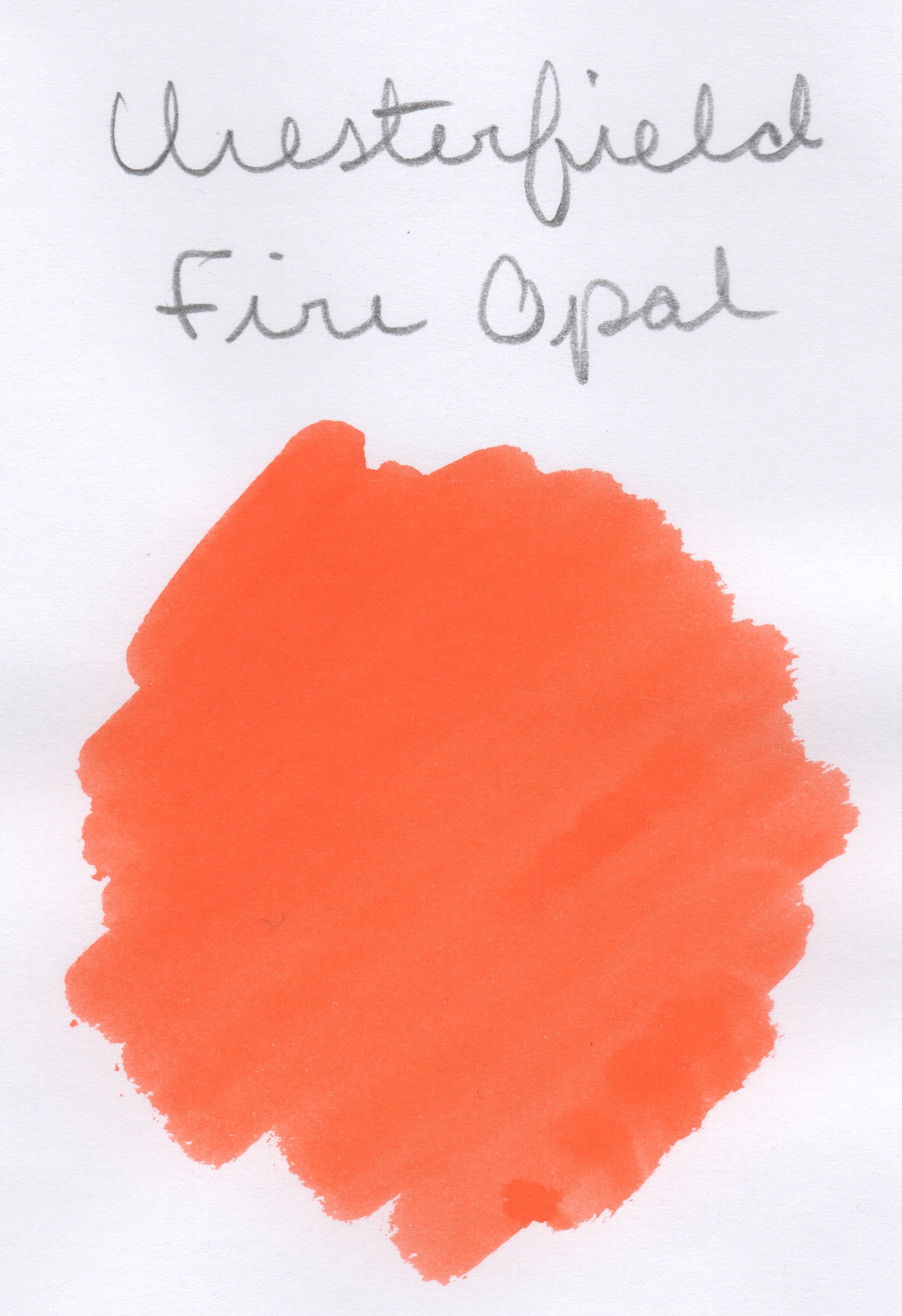
How is it November already!?!  This is how I know that I'm starting to get old, when months seem to just fly by.  But, it's not so bad since November is going to be devoted entirely to inks here, with a focus on oranges and browns to celebrate Thanksgiving coming up.  The first is this ink, which is part of the Chesterfield line sold through xFountainPens.  The Chesterfield inks are rebranded Diamine inks (FPN thread here), so I will do my best to figure out which of those inks they match up with.  There is a spreadsheet that was made by a member on FPN, so I will go off of that and if things don't seem to match, I'll hunt around until I find what does.

I've spoken before regarding my feelings towards the color orange.  This one falls into the side of the orange spectrum that really irritates me, so I will be glad to get it out of my pen soon.  On the other hand, it is a super bright, well saturated orange, which could have a place if you are grading or editing.

The intense saturation means that shading is not pronounced, at least not in a finer nib.  The ink was pleasant to write with, with no hard starts or feathering or bleeding.  There was some nib creep and my understanding/observation is that this is not uncommon with orange inks and not something to worry about.  As you can see above, it has no water resistance, but it fared well with both liquid and dry highlighters (though I cannot understand why you would want to highlight such a retina-searing color, but hey, you do you).

Fire Opal was also well behaved in a Pitch Black Field Notes, so this could be an ink you could use in your daily carry.

Now, the spreadsheet I linked above matches this ink with Diamine Orange.  I grabbed that and a few other oranges from the Goulet Pens Swab Shop tool, so let's see if that is indeed the case!

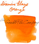
I would definitely agree with that match.  There is a bit of difference in terms of color correction in the scans, but I think the telling sign is the underlying red hue present in both the Chesterfield Fire Opal and the Diamine Orange.

Like I said, this ink gets on my nerves hardcore.  But, it was otherwise a nicely behaved ink and I can't complain about it except for the my bias against the color.  You also get a pretty nice discount buying the Chesterfield vs Diamine, at $10/100 mL for Chesterfield and $15/80 mL for Diamine.  Of course, neither of those prices is outrageous, but why not save a few dollars if you can?  The biggest difference is that the Chesterfield comes in a plastic bottle rather than glass, and my experience with those bottles is that the neck is quite narrow.  Thus, it might be best if you have another container to decant into, or you are planning to syringe fill.

This ink sample was given to me as a gift and I am not being compensated for this review in any way.  All opinions expressed above are my own, and you are free to disagree if you like.

PS - I've decided to start taking my quotes that I put in reviews from my current favorite songs, so that you can all see what horrible taste in music I have.  Anyway, I'll try and remember to put a link to the song referenced at the bottom here, in case you want to take a listen.  They won't necessarily relate to the ink being reviewed, so sorry for any confusion there.


Ink review - Cult Pens Deep Dark Orange

Before I get into the review, let's start with a short story, shall we?  

The summer before starting college, I was put in contact with my randomly assigned roommate for the dorms.  We chatted a bit about our interests and hobbies, and I asked what I thought was a totally reasonable question - did she have any colors that she absolutely hated, that she could not handle seeing every day?  I've been told this is quite strange since then.  She assured me she did not, though our roommate relationship didn't last past the first semester anyway.

Why would I ask such a strange question?  Because I have a color like that, and it's orange.  I don't mind orange as a color and I even have a few orange possessions, but if I was forced to live with someone who absolutely loved orange and decorated every inch of their space with orange, I would slowly go crazy and murder them in their sleep.

I'm guessing this slight aversion to orange is probably why I haven't tried very many orange inks. But this one was sent to me by my friend Paul and how could I refuse?  (Btw, you can find his review here.)  And it turns out that I actually like this shade of orange.  I don't think I could use it as an everyday ink, but it's certainly been fun to play with for the past week or so.

The Cult Pens "Deep Dark" series is a line of colors produced for them by Diamine that are a bit lower on the value scale than most of their inky counterparts.  This makes them particularly interesting for people like me, who aren't super into garish inks but still want to have some excitement in their writing.  Of all the Deep Dark inks, I would say the orange is the least deep and dark, but it's definitely different enough to make it something special.

In terms of behavior, this ink was right on line with a lot of other Diamine inks that I've tried - decent flow, not much for feathering or bleeding on decent paper, and some shading if you are using it on ink resistant paper (the stuff I use for my ink reviews now is not the best, but I also tried it on Tomoe River and it's fantastic).  But it also suffers from the same shortfall I've seen with most other Diamine inks, in that it is not super high on the water resistance factor.  At the same time, most inks on the red and orange end of the spectrum are worse than this, so I'll take the small amount of water resistance offered as a victory.

Something else interesting that was brought to my attention by my manfriend, Wesley, is that this ink sort of looks like J. Herbin Rough Hematite, at least how Rouge Hematite looks when you use it on paper that leaves a good amount of the gold on the surface.  Like I said before, this is not the most ink resistant paper around, but I did a swab of each to compare and they do indeed look a bit alike:

Deep Dark Orange on top, Rouge Hematite on the bottom

So, I suppose that this ink could be a good alternative to Rouge Hematite if you don't care about the actual sheen and don't want the potential maintenance issues that come with a sparkly ink.

Overall, I really like this ink, but I'm not sure I will be buying a bottle anytime soon.  Being that it is a Cult Pens exclusive, I would have to order it from England and, well, the dollar is not the strongest against the pound right now and then shipping is expensive and yeah... *sigh*  But, if I ever had another reason to order from Cult Pens (I hear they are nice people, so my only reason to not order is the unfavorable exchange rate), I would definitely add on a bottle of this to my order.