Ink review - J. Herbin Bleu Myosotis

This might be hard to believe for some of the newer blog readers, but I used to be a pretty prolific ink reviewer.  I am working on getting back up to some sort of reasonable speed, so hopefully you'll be seeing a higher frequency of ink reviews to come...

This ink came in the form of a cartridge that I purchased in a large group of single cartridges and samples from a member on FPN.  The collection was mostly blues and I had written off quite a few of them simply because I am not a lover of blue inks unless they have some sort of other interesting quality, but after seeing this one I am thinking I should reevaluate my position and try out some more of them.

Bleu Myosotis, or "Forget-Me-Not Blue" is not really a pure blue ink, but more of a dusty indigo.  I find that most of the J. Herbin inks I try are not super saturated, which usually lends them to some pretty spectacular shading.  That was not so much the case here, though I think that shading was lacking because the flow was sooooo generous in my pen.  J. Herbin inks tend to be pretty free flowing anyway and I had just disassembled my ink testing pen for cleaning prior to loading it up, so I think that perhaps my nib and feed were not quite seated correctly.

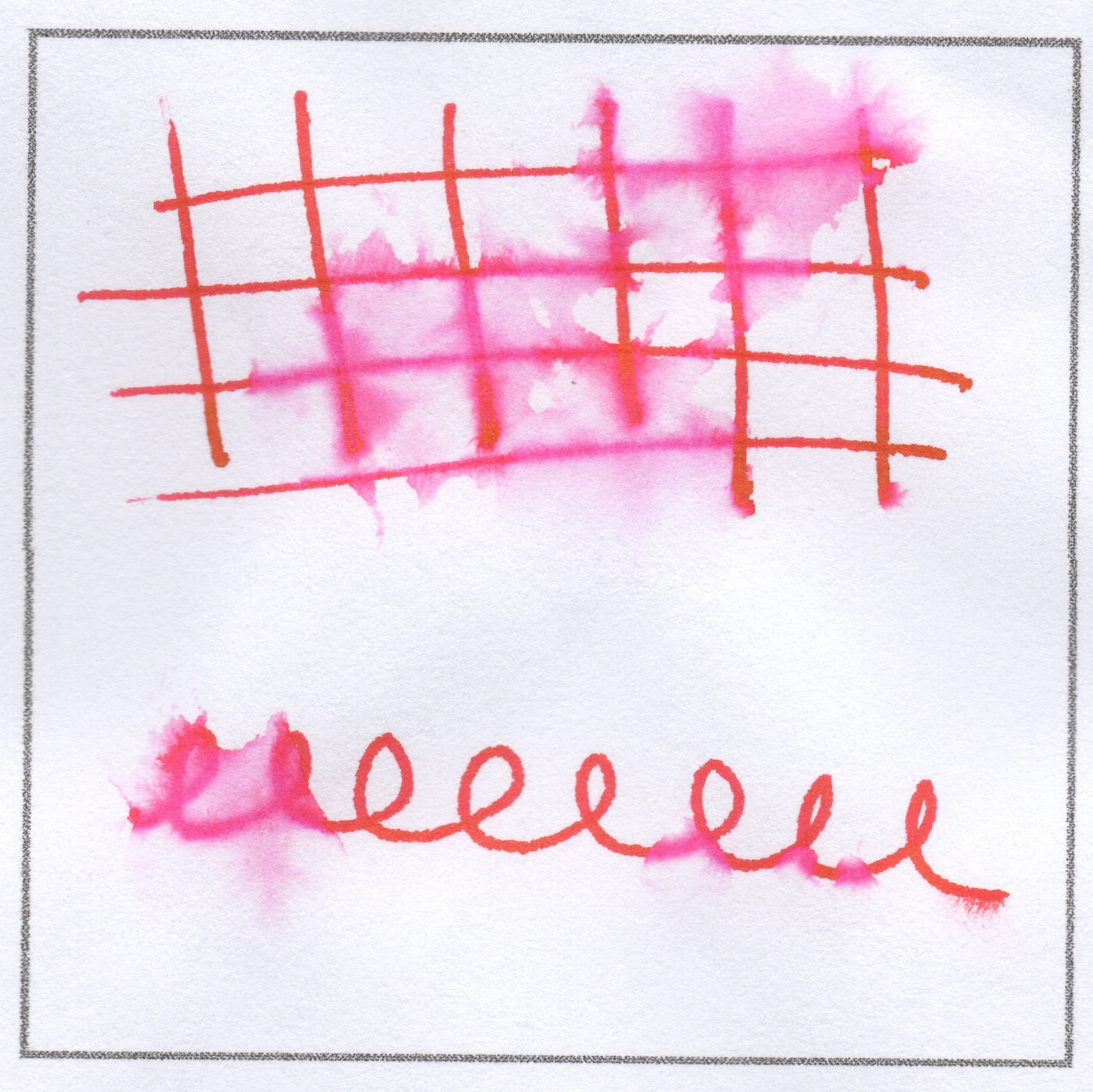
I assure you that I did actually drip water on the scribbles to the left, but it is not super noticeable.  I would put this ink up there with Poussiere de Lune as being water resistant enough to not worry too much about my writing being destroyed by errant raindrops, but not waterproof enough that I would address an envelop with it.

Overall I think this is a solid performer, though I'm not all that interested in getting a full bottle anytime soon.  I would, however, pick up a pack of more cartridges, since I think it would be a good ink to use in my Kaweco Al-Sport, that is if I ever get it back from my older brother.  (I kid - he is in Rome for the summer and is borrowing the pen so that he can have a reliable writer that will fit in his pocket.  I have no doubt it will come back and be better for the journey.)

Has anyone else tried this ink?  How do you like it?  I know that my writing looks a lot darker than other reviews I've seen, so take the examples above with a grain of salt.

Pen Review - Franklin Christoph Model 65

I admit, I'm usually the last one to the party, if I even show up at all.  (Metaphorically speaking, of course - if I actually have somewhere I have to be, I'll show up at least 10 minutes early...)  There was quite a bit of buzz last week about the FC Model 65, due to great reviews over on The Pen Addict and The Gentleman Stationer.  My review comes courtesy of my friend Paul loaning me his black Model 65, and if you want to skip all the wordy bits you can head down to the bottom of this post where there is a video, though it's not my best production since my autofocus was constantly being thwarted by the highly reflective finish on the pen.

Physical presence
Let's start with the obvious, at least what will be obvious if you get this pen in your hands - it is a loooooonnnggg pen.  This is because the Model 65 is meant to be a desk pen, which in general tend to be longer in order to be more comfortable for longer writing sessions.  Luckily, it is also quite a light pen, so the extended length does not become unwieldy in any way.

L to R: Lamy Safari, Model 65, TWSBI Vac 700

As you can see in the picture above, the Model 65 is just a bit longer than the Vac 700, which is the largest pen I own and certainly not a lightweight at all.  The real feeling of the size of this pen can be seen when it is uncapped, where you can see that most of the length of the pen is in the body:

Head and shoulders above the rest

This pen does indeed post and because the cap is so short and the pen itself so light and well balanced, I found that posting did not throw off the balance of the pen at all.

I am pretty sure that the Model 65 is made from acrylic, and while it is polished to be very shiny, this pen is not slick to hold.  The material has a bit of grip to it, in a way that is hard to describe in words.  Just know that this pen never felt slippery to me, though I do not have especially sweaty hands.

Being a desk pen, the Model 65 is clipless since you don't need a clip for a pen that will never be clipped to anything...  I happen to not be the biggest fan of the aesthetics of a clipless pen, but a nice feature that was included on this one is a flattened side on the body of the pen, so that you never need to worry about things rolling away and landing nib down, as we know nice things are wont to do.  You can see this in the very first picture of the post, as well as the name of the pen engraved in said flat spot.  The engraving is very subtle when not seen in direct light, and I think the whole presentation is a very classy way of branding a pen.

Writing experience
The Model 65 takes #5 nibs, so I'm assuming that you could swap in a lot of vintage or modern nibs of that size.  However, given the huge selection of nibs that Franklin Christoph offers, including custom grinds from Mike Masuyama, I doubt you would need to do searching elsewhere to find a nib that fits your style.

The nib I tried was a basic steel M.  It was not the best nib I've ever used, but it was pleasant, smooth, and reliable, so I can't complain.  Given that even the most "boring" nib I could have used was not disappointing in any way, I would have great confidence in future FC nibs.

The section of the Model 65 has a slight hourglass shape which combines perfectly with that slight "stickiness" of the material to really lock your fingers into place and make writing very stress-free.  There is also no concern of threads getting in the way, since FC does a neat little trick of putting them at the nib end of the section, thus allowing users to hold the pen as high or low as they want and never having fingers rub on threads (though they are quite smooth on this pen anyway, so it wouldn't be an issue regardless of placement).

Filling system
Not too much to say here - this is a cartridge/converter pen, that takes standard international sizes.  Given that there are no metal parts other than the nib, you can also use it as an eyedropper and given the huge size of the pen, I would be that eyedroppering it would give a giant capacity suitable to starting the draft of an epic novel.

Closing thoughts
I like this pen.  I don't really have a need for a desk pen, but if I did I would seriously consider one of these.  My biggest problem is the cost, which I guess is a common theme around here?  It's not that I think all pens are overpriced, but this particular pen with a steel nib will run you $150, and it goes up from there if you want a gold or custom ground nib.  And for that price you are getting into other pens that come with a gold nib as a default and are also quality products (I'm thinking Pilot here, as well as a few Lamy pens).  

However, if you are in the market for a desk pen, chances are you are not looking for a "budget" item because, well, a desk pen is not the pinnacle of convenience for all-purpose use.  If that's the case, I would definitely recommend this as a desk pen, and I am hoping that when I go to the DC pen show this summer, I will be able to check out some of the other finishes that might be a bit flashier than the basic black.

And, if all those words were not quite enough (or if it was too many words), here is the review in moving picture form:


Paper review - Field Notes Cherry Graph

Follow the spring 2014 Shelterwood limited edition, the Cherry Wood Field Notes brings woodgrain back into regular rotation.  For now it is a regular edition, but non-kraft regular editions have been known to disappear in the past so I will definitely be keeping an eye out for any announcements of this edition being discontinued so that I can stock up.

Field Notes Cherry Graph with a brown Pilot Juice

Size
This notebook is the standard “pocket size,” aka 3.5” by 5.5”, which happens to be my preferred size for a pocket notebook versus a passport size (which is just as wide but slightly shorter) or an A6 (which is slightly larger is both directions).  Still small enough to fit even in the tiny pockets on women's jeans while maximizing writing space within that constraint.  That said, these would not be my favorite notebooks to draft a novel in, but for carry-around-beat-em-up books they are ideal.

Binding
Field Notes uses a three staple saddle-stitch method to bind their books and this one is no exception.  It’s certainly not the most robust method ever, but it works.  If you are carrying these notebooks naked in your pocket for any extended length of time, it’s quite likely that at least one of the staples will lose its hold on the cover before you run out of blank pages, but my notebooks tend to be chauffeured around in a case of some sort and they have all survived just fine.  

Something extra special about the staples in this edition is that they are gold colored instead of the standard silver, and with the woodgrain cover they really make this feel like a luxury item rather than a stock edition.

Paper
One thing I really like about most Field Notes books is that they use bright white paper.  Sure, cream and soft white paper have their place, but I don’t like having the color of my writing muddled by the color of the paper and I have rejected many notebooks in the past for not having the right color of paper (Rhodia Webbie, I’m looking at you).

The grid in these notebooks is printed in a light brown, which they identify as “Double Knee Duck Canvas” in color.  I don’t know what that means, but it ties together well with the overall color scheme and walks the fine line between being dark enough to be useful while not being so dark as to be obtrusive.  Also, the 3/16” spacing works perfectly for my handwriting, especially in a pocket notebook where I’m not using fountain pens primarily.

The reason that I don’t use fountain pens much in this (and most Field Notes editions) is because the paper is not the most friendly to liquid inks.  Pens don’t feather much but they do bleed, even finer nibs, and I am too much of a tree-hugger to only use one side of each sheet.  I don’t mind that I am “forced” to use other quality pens like the Pilot Juice in here because then I don’t have to worry about dry times or waterproof-y-ness either.

Cover
Let’s be honest, the cover is really what makes this a special notebook.  And the cover is definitely something really special.  As far as I understand, it is made using the same process as the Shelterwood, where a super thin layer of real wood is glued to kraft paper and then viola, you have a wood grain cover!  Because of the natural origin of the wood veneer, no two covers will be identical and I really enjoy that aspect.  There is also a slight roughness to the covers, though it’s not like you will get splinters for from it.  But if you are a person who prefers a smooth notebook cover, this might not be for you.  They also have a tendency to curl outward, which means that for my use the notebooks don’t lay super flat, though I suspect that back pocket use could help to alleviate this.

Compared to the Shelterwoods cover (made out of cherry as well), I find these covers to be lighter in color and far more aesthetically pleasing, at least to me.  The first picture below is the Shelterwood and the second is the Cherry Graph:

Shelterwood cover

Shelterwood cover

Cherry Graph cover

I don’t have any Shelterwood notebooks to hold side-by-side with the Cherry Graph, so it could just be my poor memory playing tricks on me.  The scans look pretty similar, but it seems that I am not the only one who notices a color difference between the two.  Also, I think that they are lighter and more complex in real life than what the scans of the covers can do, so take the pictures with a grain of salt.  Another difference between the two editions is that the Shelterwood had white printing on the cover, while the Cherry Graph has the standard black.  I am relatively indifferent either way, as both colors look great on the woodgrain. 

Overall
I luuuuurrrrve these notebooks.  As long as they are a regular edition I plan to have one in active rotation and even after they are retired I will probably have stocked up on so many that I’ll be using them for years to come.  They give that special edition feel with the availability and price (3/$10) of a stock edition, and I think that is a combination that can’t be beat.


Ink review - J. Herbin Rouge Hematite

Rouge Hematite is a bit of a legendary ink - as far as I know, it was the first to have those pesky little metallic particles in suspension so that we can have sheen any time we want.  It's also a bit legendary for having a super inconvenient bottle to fill out of, but that's a whole other story - I find that the most practical bottles are often not the best looking and the Rough Hematite bottle is definitely a looker.


For me, this ink is a bit meh.  My bottle was received as a Christmas gift last year, so as of right now it's the latest formulation (there have been a few versions).  I think that there is less gold particulate this time around, and I have not noticed the layer of gold along the bottom of the bottle that I saw with Stormy Grey.  To me, that layer of gold is a sign that the solution has been over saturated and that's never a good thing.

Overall, I don't love this ink.  It's a nice red, but the gold sheen doesn't come out on every paper.  On Tomoe River paper, this ink is gorgeous.  On regular copy paper or even the 24 lb paper that I used for this review, the ink soaks in a bit too much and it loses what makes it special.

On the other hand, this is a pleasant ink to write with.  It has good flow and I've never had any problems with pen clog-age.  Still, this is sort of a pigmented ink, so you need to exercise really vigilant pen hygiene here.  Don't leave this ink in a pen that you plan to use infrequently - in that case, ink up with just what you need, use it, clean it, and repeat as needed.  And if you are going to be using an entire fill of this ink, probably best to use a pen that can be disassembled so you can really scrub the feed clean.

It annoys me that the ink is not very water resistant.  Especially if you are using it on paper that really shows off the sheen, it will disappear when hit with moisture.  True story, I have a page in an old journal where I wrote a quote in this ink and then left it sitting a bit too close to my kitchen sink.  Let's just say that it's not quite as pretty anymore...

Overall, I think this is an ink that would be best experienced via a sample.  Then you get a chance to get the special experience without spending the money and space on a full bottle.  But hey, I could be wrong!  Let me know if you use this ink a lot, and if so, how do you use it?

Here's a scan of the full review sheet:

This ink was given to me as a gift and I am not being compensated for this review in any way.  All opinions above are my own and you are free to disagree with me if you like.

Pen Review: Pilot Custom Heritage 92

(PSST!  If you would rather watch this review than read it, you can find the video version here.)

This is another pen where I have mixed feelings about it.  Full disclosure, this pen is on loan to me from a friend (you should click on that link and check out his blog!) for this review, and the fact that I did not buy the pen myself factors into my overall feelings later on.  But for now, let’s break it down a bit:

Physical presence
As is my custom, I won’t list any hard numbers here because there are plenty places that you can find that information online.  Rather, let’s talk about some things that are less tangible, because those are what makes all the difference.

1.jpg

There’s no denying that the 92 is a real looker.  I would describe the aesthetic of the pen as “modern but classy” and I think all the parts really fit together well, from a design standpoint.  If you aren’t a fan of demonstrators then this is probably not for you, but I am.  I especially like the black plastic used at the top of the cap (finial?  I’m never exactly sure what part of the pen that is) and on the piston knob.  These parts seem minor but to me they give a sense of the boundaries of the pen. I also appreciate the silver colored hardware, since I find gold hardware on pens to be a bit stodgy. 

2.jpg

One of the first things I noticed about this pen was how light it is.  The pen is (obviously) plastic, so it would unreasonable to expect it to be very heavy.  Still, I think I subconsciously equate weight with quality and that is simply not the case most of the time with fountain pens.  This is also the first pen with a premium price tag I have used made out of plastic and so I was surprised when I held it and it felt just like a Lamy Vista.  I would assume that the quality of the materials that go into the 92 is higher than a $30 fountain pen meant for children, but I don’t know anything for sure about that.

4.jpg
3.jpg

Another thing that contributes to the light weight of the 92 is the fact that it is a relatively small pen.  It’s both slightly shorter and slimmer than a Safari, especially when uncapped.  It can be posted, but I find it comfortable enough to use unposted.  The weight when posted is slightly shifted toward the back, but still comfortable.


Writing experience
The nib on this particular pen was a F and boy is it fine!  Below you can see the line width compared to some other writing instruments I had on hand:

Though the nib lays down a quite thin line, I did not find it to be unreasonably scratchy.  I also have experience with a F from a Pilot VP and I found the performance to be similar.  In my limited experience (5 pens) with Pilot’s nibs I have never been disappointed and I would expect that to be the case most of the time.  Though this is a gold nib, I didn’t find it to be at all flexible or springy, and especially with how fine it is I would suggest making an effort to keep a light writing pressure.

Of course, the writing experience is not just about the nib.  You can have a great nib on top of a poor section and the result is a pen that doesn’t get used.  The section on this pen is short but there is nearly no step between the section and barrel so you can hold the pen as far back as necessary.  The threads are fairly shallow and I do not find them uncomfortable to hold at all.  The nib end of the section flares out just slightly and prevents fingers from slipping down to far onto the nib.


Filling system
As far as I know, this pen is Pilot’s only piston-filler, at least in the American market.  I found the piston on this pen to be very smooth to operate and the knob at the end of the pen is large enough to turn easily without needing lilliputian fingers.  While I, again, do not have an exact number for the ink capacity of the pen, it seems like it would be fairly large, definitely over 1 mL.

Otherwise, the filling system is not all that noteworthy.  That may sound like a bad thing, but I prefer a filling system that doesn’t require much thought beyond filling and cleaning because in between those times I would rather think about writing!

One thing I noticed while using this pen was that there seemed to be a bit of ink seeping past the piston seal.  I’m hoping that the previous pictures show this, but without a dedicated macro lens it’s a bit difficult to photograph.  I’m confused as to how this happened, since the pen never left a safe spot on a flat surface in my apartment.  It certainly isn’t enough of a problem to cause concern, except that the pen seems to be unable to be taken apart.  As far as I can tell the body and section are all one piece, which means that it is tough to take the pen apart to dry after cleaning.  I found a hint that the piston can be removed using the same wrench that comes with TWSBI pens, and it certainly looks like this could be the case.  However, given the cost of this pen and the fact that it’s a loaner, I don’t want to start disassembling the pen.

Closing thoughts

If I did not know the cost of this pen, I would be all over it like a monkey on a cupcake.  It writes well, looks snazzy, and has a high capacity filling system.  But, the fact is that price is a factor for those of us trying to live within our means, and that’s where I find the problem with this pen.  As of the writing of this post (spring 2015), you can find the 92 for ~$130 on eBay and Jetpens, and $220 on Goulet Pens (and others, I don't want to paint GPC as the bad guys here!).  

Facing a price tag greater than $200 seems ridiculous for this pen, especially since the materials it is made from are not all that special.  You are either paying an extra $60 for a piston (92 vs CH 74) or an extra $150 for a gold nib (92 vs TWSBI 580, though I do know that this is roughly the cost of a gold nib).

The $130 price seems a bit more reasonable, but for that price I would rather have a Vanishing Point.  The VP is built like a tank and I never worry about tossing it in my bag and taking it with me anywhere.  The 92, being made out of plastic, feels a bit more fragile and I would feel the need to always keep it in a pen case, which is slightly inconvenient.  And, the fact that it has a screw top makes it far less useful to me than a click pen.

Overall, I think this a great pen with a high price.  I think that if you want this pen you should definitely hunt for a way to get it under $150, even though that might mean ordering it from a seller in Japan.  Or as for it as a gift from a rich relative, either way…